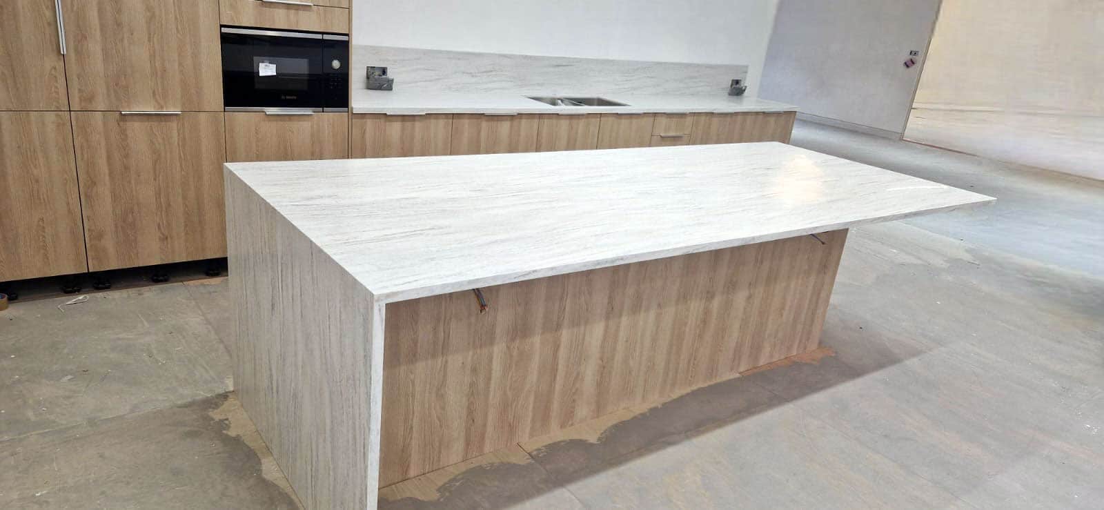

Biophilic design has been at the forefront of people’s minds for some time, with the benefits of being around nature unquestionable, so why not consider bringing some of this nature indoors.
You can incorporate nature into your design, with a Solid Surface planter, where indoor plants can reside, together with complementary colour of Solid Surface for your counter tops and vanity units.
Within the many ranges of Solid Surface materials we work with, there are many vibrant colours that can be used to add a “pop” of colour to your area to encourage feelings of wellbeing, happiness, and energy, understanding the psychology of colour can really help to enhance designs.
If you are looking to create an oasis of tranquility why not introduce a calming neutral colour, such as Corian Limestone Prima, or use shades of blue like Hi Macs Sky Blue 🔵, if you feel the need to be energised, introducing a bold colour such as red, like the Hanex M-Red 🔴 into your colour palette will certainly help.
This year is the year for changing trends, Pantone’s colour of the year is Peach Fuzz, Apricot Crush is WGSN’s colour of the year, and Dulux’s is Sweet Embrace, all are peach and pinky hues, demonstrating a new leaning towards warmer, less industrial designs. These hues also help to replenish and nourish the body and mind.
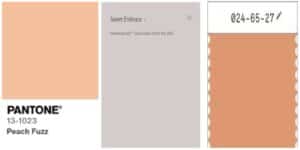
Trends we have been seeing more of include peaches, pinks, terrazzo’s as well as a greater requirement for bespoke colours.
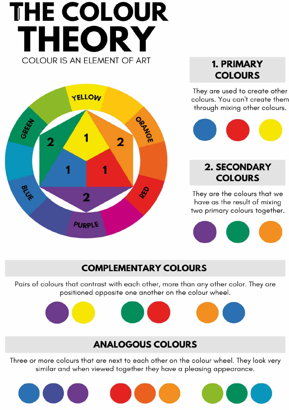
With so much choice of colour, and the apparent leaning towards warmer, more inviting designs, if you feel stuck choosing complementary colours for your designs, you could consider using a colour wheel to help make decisions.
We will leave you with some photos of projects we have worked on in the past…
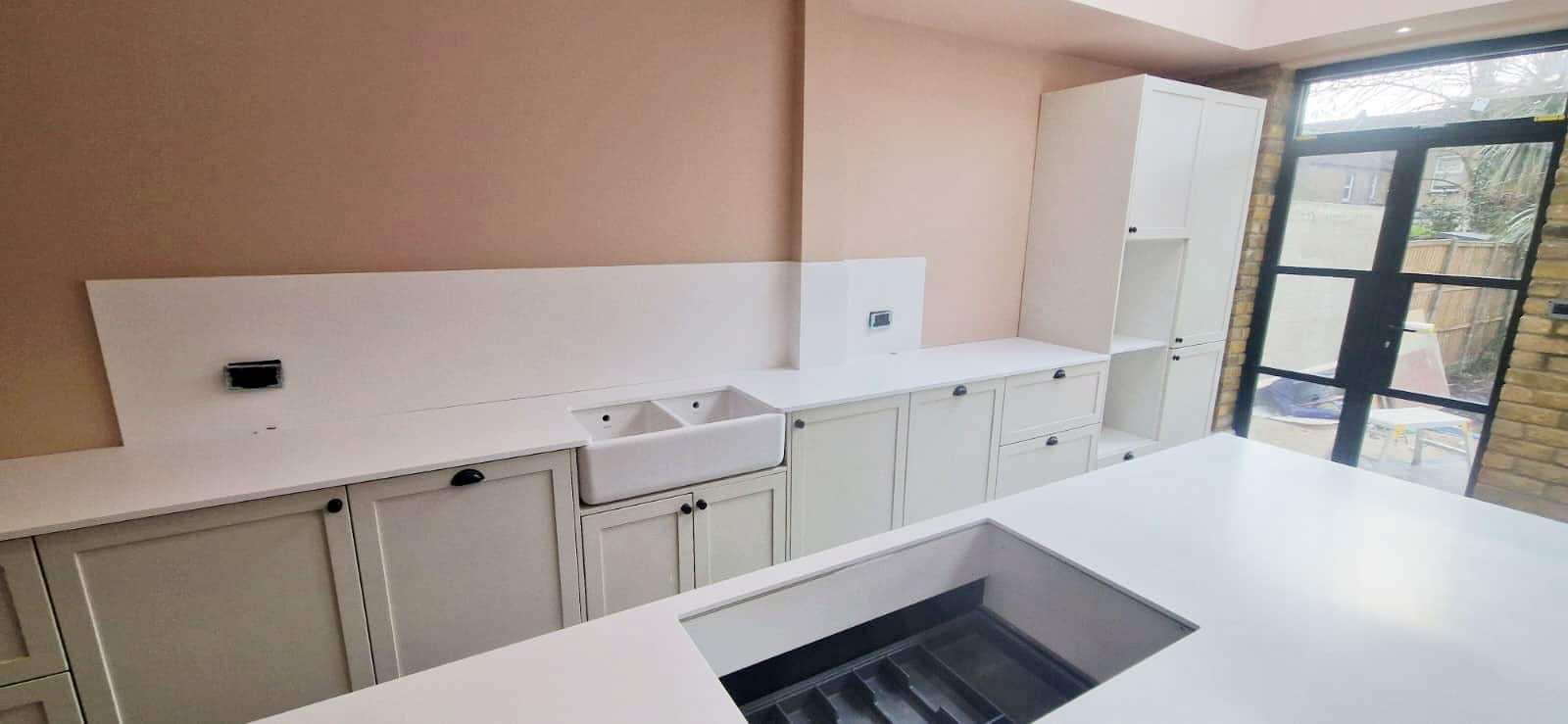

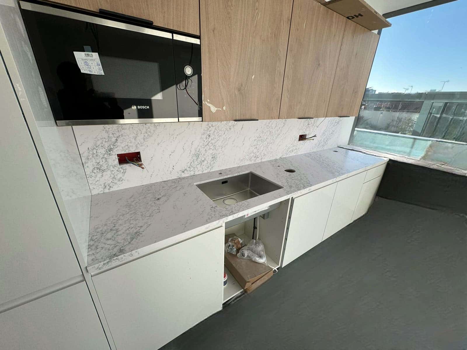
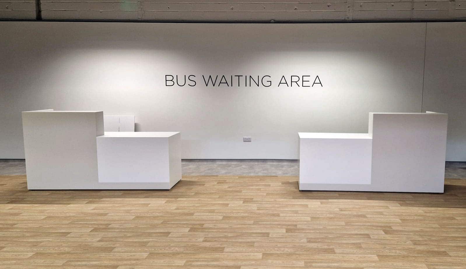
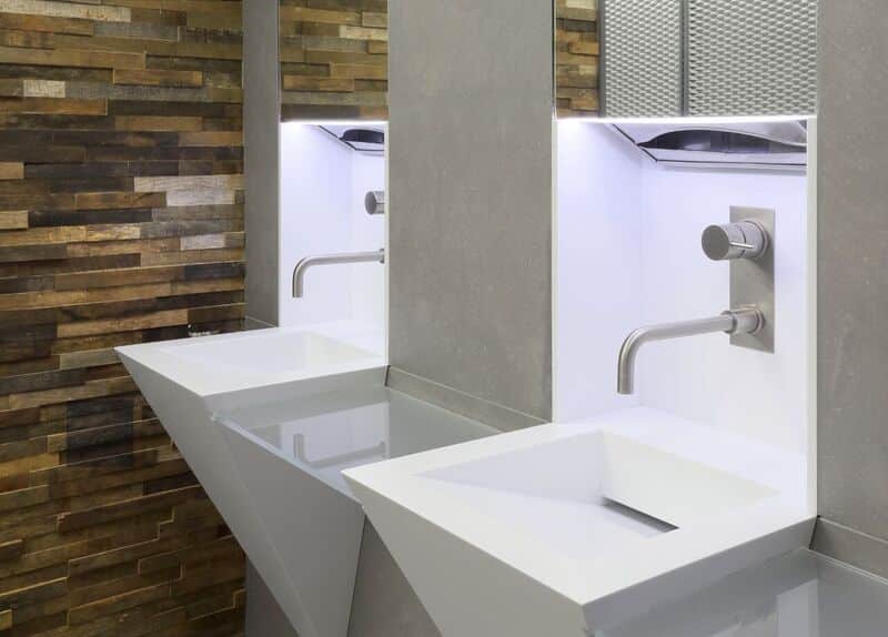
Solid Surface materials like Corian and Staron offer hygienic, easy-to-clean, non-porous surfaces ideal for kitchens and bathrooms. They resist bacteria and stains, ensuring cleanliness and elegance.
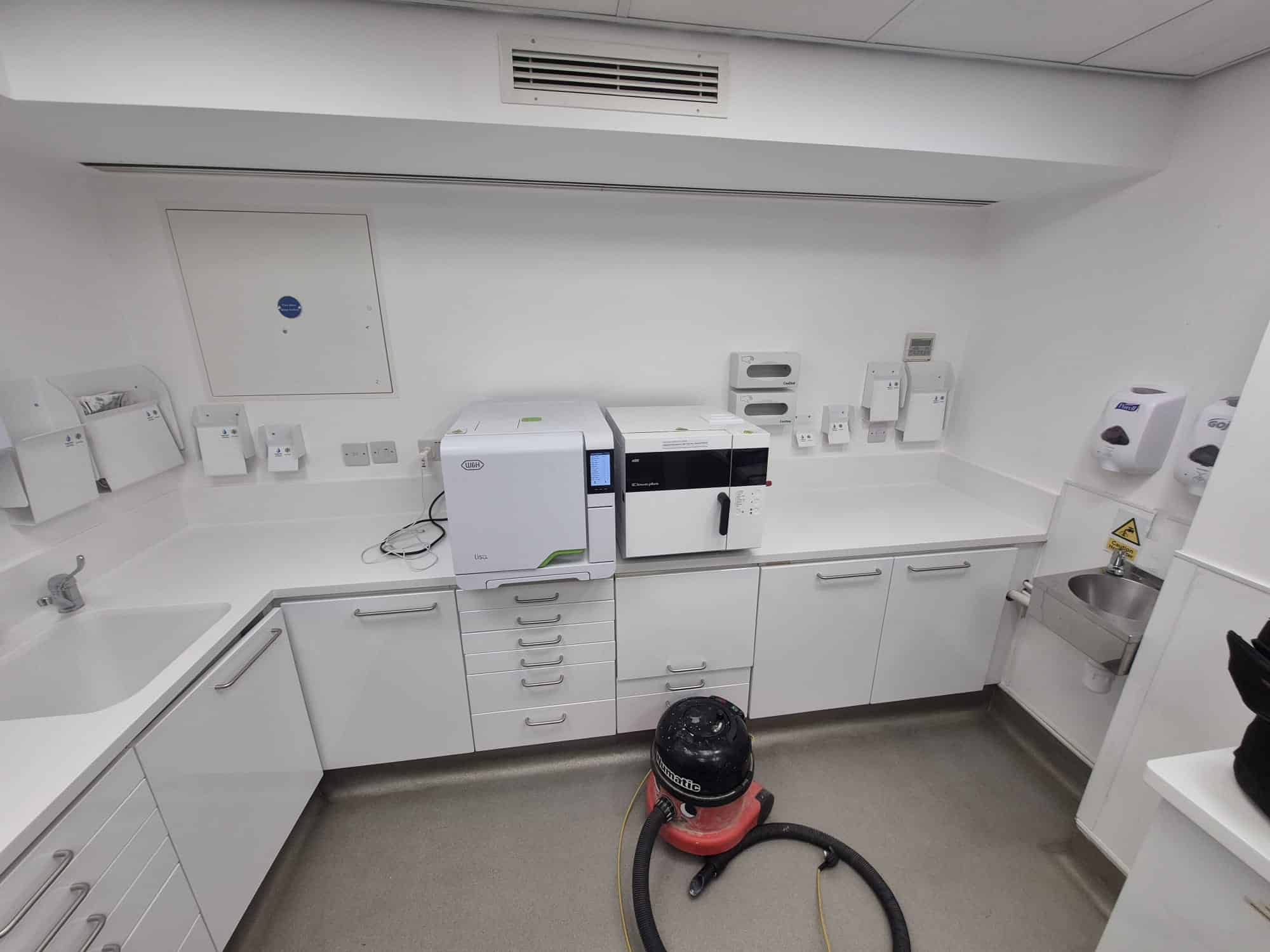
If you've ever worked in a commercial kitchen, you know the worktops take an absolute battering. Hot pans, constant prep work, endless cleaning cycles – and that's just one lunchtimeSo when it comes to choosing surfaces for professional kitchens, this isn't about what looks nice in a showroom. It's about what'll still be standing (and hygienic) after years of service.
Need help with a project? Contact us for more details.


