Autumn and Winter 2025 /2026 Interior Design Trends
Autumn and Winter 2025 / 2026 are set to be seasons defined by colour that feels both grounding and expressive. According to forecasts from WGSN, Coloro, Trend Bible, Pantone, Colour Hive, Dezeen, and Dulux, the coming months will focus on palettes that anchor us with earthy, heritage tones while introducing bold pops of colour for individuality. The overall message is about balance, comfort and nostalgia on one hand, and confidence and creativity on the other.
What the Experts Are Saying
Autumn and Winter 2025 /2026 Design Trends vary from source, but all remain rooted in the use of colour
WGSN & Coloro have announced shades like Celestial Yellow, Cherry Lacquer, Retro Blue, Neon Flare, and Future Dusk as key colours for Autumn/Winter 25/26, reflecting optimism and depth in equal measure 👉 WGSN & Coloro announce key colours for Autumn/Winter 25/26
Pantone describes the season’s palette as “poetic nuance,” a mix of timeless neutrals and daring accents that invite designers to get more expressive. 👉 Trend Bible Home & Interiors Autumn/Winter 2025/26 Forecast
Trend Bible is seeing a shift towards grounding palettes and heritage-inspired richness, 👉 Trend Bible Home & Interiors Autumn/Winter 2025/26 Forecast while Colour Hive and Dezeen are highlighting the role of texture and layered tones to create depth and interest.
Dulux is favouring warming neutrals that can act as versatile backdrops, while fashion forecasts mirror interiors with rich oxblood, earthy browns, and jewel tones making a statement across catwalks.
Together, these insights reveal that interiors for Autumn/Winter 2025 should be about creating spaces that feel inviting, layered, and memorable, with colour playing a starring role.
Key Colours for Autumn & Winter 2025
The dominant tones this season are earthy and nostalgic: terracotta, oxblood, forest green, camel browns, and sandy neutrals. These shades provide a grounding base that can be built upon with more expressive accents.
Complementing these are bold jewel tones and statement colours, such as plum, mustard, Retro Blue, and Celestial Yellow. These bring personality and vibrancy to otherwise muted schemes. Future Dusk, a moody, almost cosmic purple-blue identified by Coloro, offers drama and sophistication, perfect for feature walls or statement furniture.
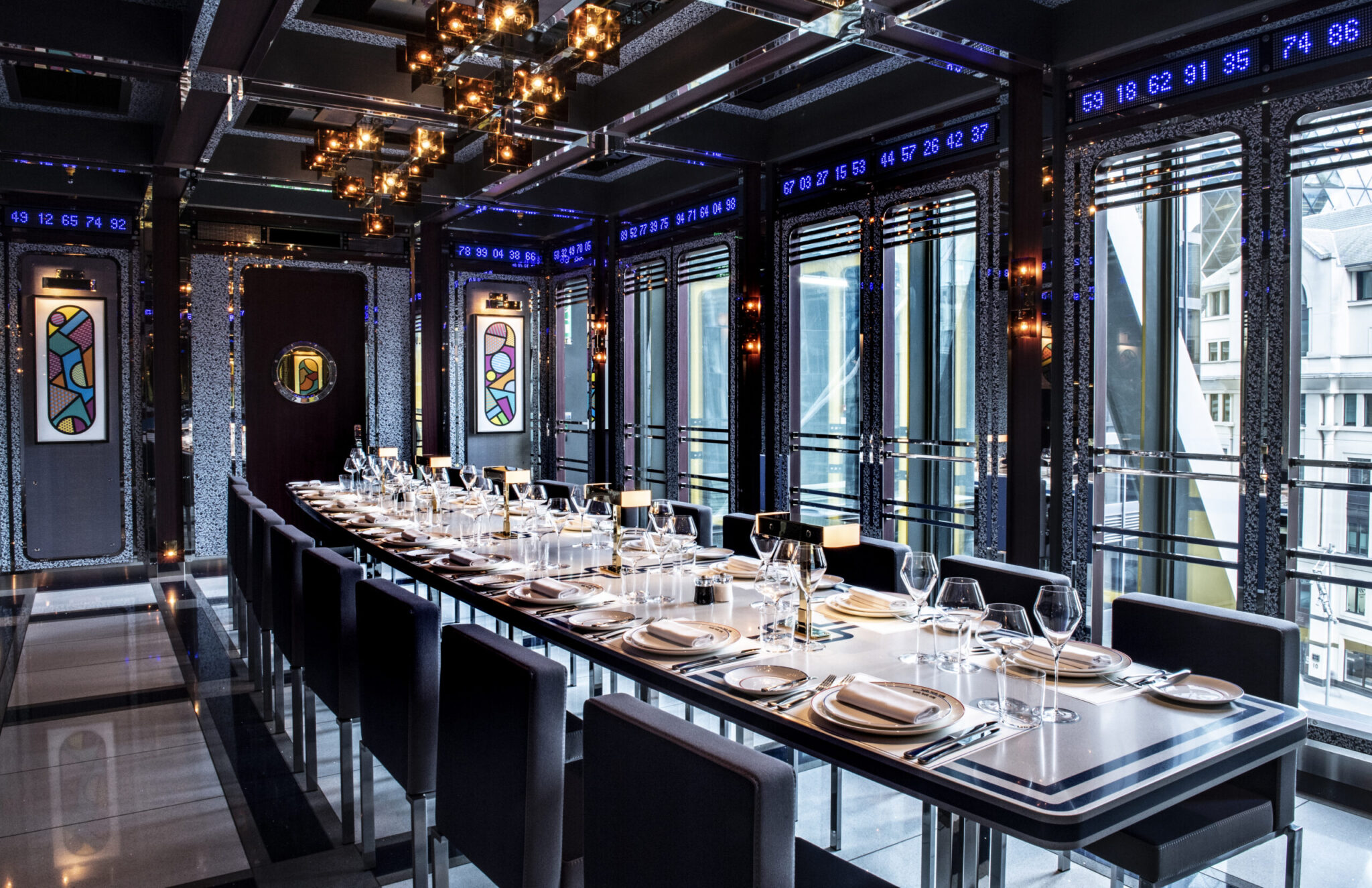
Talking of feature walls, these appear to be taking centre stage at the moment, as we are noticing a lot more desire to see one statement wall, with complementary furniture and soft elements.
Fluting has been a popular design feature for some time, and it does not appear to be going anywhere anytime soon, we have seen a lot of these sorts of designs, and continue to see them going at this time.
We have also seen a requirement for greens and pinks, with terrazzo styles, concrete looks and veined looks holding strong.
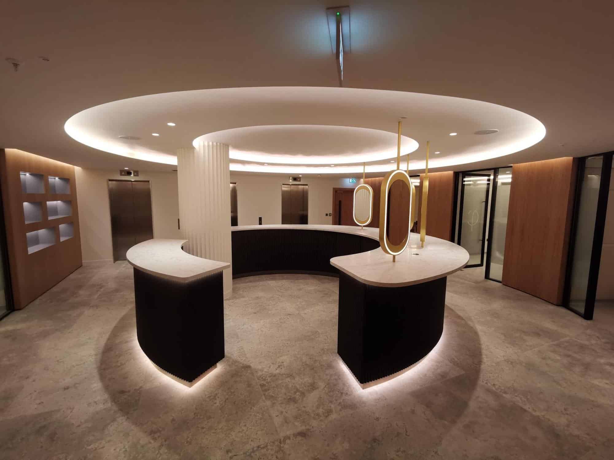
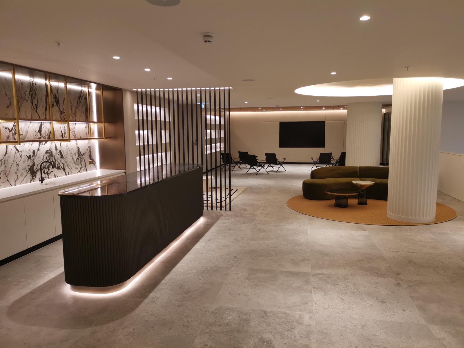
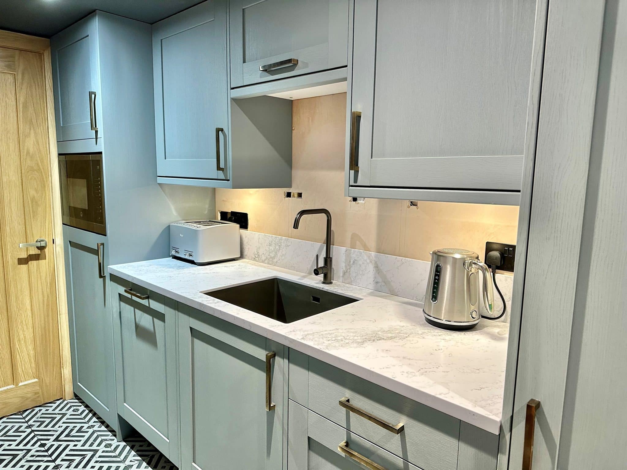
Solid Surface Pairings for Office Interiors
Office interiors are moving away from stark minimalism and towards warmer, layered schemes that enhance productivity and comfort. Solid Surface materials provide the perfect foundation to bring these palettes to life.
Glacier White Corian, White Quartz HIMACS, or Durasein Triostone brighten collaborative areas and allow deeper tones like oxblood or forest green to shine without overwhelming the space.
Chic Concrete HIMACS and Slate Grey Hanex create an industrial-modern look, perfect for worktops, breakout tables, or shelving, especially when paired with Cherry Lacquer or Retro Blue accents.
Soft Statuario Meganite adds quiet luxury for meeting rooms or boardrooms, pairing beautifully with plum or mustard accessories for a timeless yet modern feel.
Solid Surface Pairings for Retail Interiors
Retail design is increasingly about storytelling, creating spaces where customers feel immersed and inspired. Colour trends for Autumn/Winter 2025 play directly into this, and Solid Surface is a material that allows for creative, durable, and hygienic applications in high-traffic environments.
HIMACS Aurora Magnolia is ideal for service counters or display plinths, introducing a calming feel that pairs effortlessly with mustard details.
Tristone Cream Sands brings sandy warmth that complements terracotta, camel brown, and oxblood, helping to create spaces that feel rich yet approachable.
Pebble Ice Staron® offers a tactile, organic base that grounds dramatic shades like Future Dusk or Celestial Yellow, helping bold features feel anchored and intentional.
Why Solid Surface Works for Seasonal Design
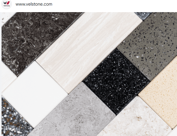
Beyond aesthetics, Solid Surface brings practical benefits that make it a go-to choice for office and retail projects. Its seamless finish, non-porous surface, and easy maintenance make it ideal for busy environments, while its adaptability allows designers to shape, thermoform, and refinish surfaces to suit evolving trends. With brands like Corian, HIMACS, Hanex, Staron, Dursasein, Durat, Tristone, Krion, Kerrock, Tristone, Velstone offering a wealth of colours and finishes, Solid Surface becomes not just a material but a medium for design storytelling.
Looking forward…
Autumn and Winter 2025 are about more than just colour, they’re about creating spaces that feel expressive, grounded, and enduring. Earthy heritage tones paired with bold accents bring personality and warmth to commercial interiors, while Solid Surface provides the perfect foundation to support and elevate these palettes. Whether it’s a retail counter in HIMACS Aurora Magnolia, an office reception desk in Chic Concrete, or a meeting room table in Soft Statuario, the right combinations ensure interiors are not only on-trend but also timeless, functional, and built to last.
To learn more about the colours of Solid Surface that can complement your project, take a look at our handy colour selector.
We hope this is of use and interest. We love talking about colour, as it can make such a huge difference to a design.
If you would like to talk about how using Solid Surface can add a pop of colour to your project, or bring calm to a sea of colour, please do contact us by email or give us a call on 01277 263603.
_________________________________________________________________________________________________________
Nicola Barden is the Managing Director of BSF Solid Surfaces Ltd, with 26 years of experience under her belt. She is also a wife, mother to her autistic son, and has three crazy cats and one loopy dog. She enjoys training at the gym, dancing, reading, nature walks and being out and about.
What is Solid Surface? Solid Surface is a man-made material that has changed the way we design interiors. First developed in the 1960s, it was created to offer something different to natural stone. Where marble, granite and quartz are beautiful but limited, Solid Surface offers strength, versatility, and creative freedom.
Velstone Solid Surface: The Hybrid That Balances Strength and StyleWhen it comes to Solid Surface materials, Velstone Solid Surface is a trusted name that blends the best of both worlds, acrylic and polyester. This hybrid composition gives it a unique balance of durability, workability, and value, making it a versatile option for a wide range of commercial interiors.
Solid Surface materials , like Corian, HIMACS, Hanex and Staron, offer exceptional durability and versatility for kitchens, bathrooms, hospitals, and commercial spaces. Their non-porous nature ensures hygiene and easy maintenance.
Need help with a project? Contact us for more details.